Theme editor

Build your online store
part by part, yourself.

18 parts and over 160 layouts, from header to footer. You see each choice in the preview instantly and publish when you like it; no coding needed.

On every plan; works with all 10 themes.

Fenikya theme editor — build your theme
Ready-made combinations

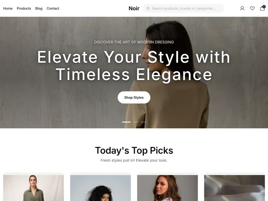
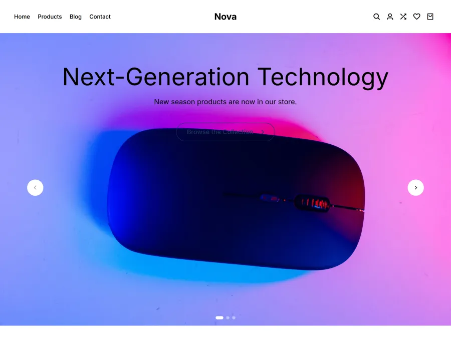
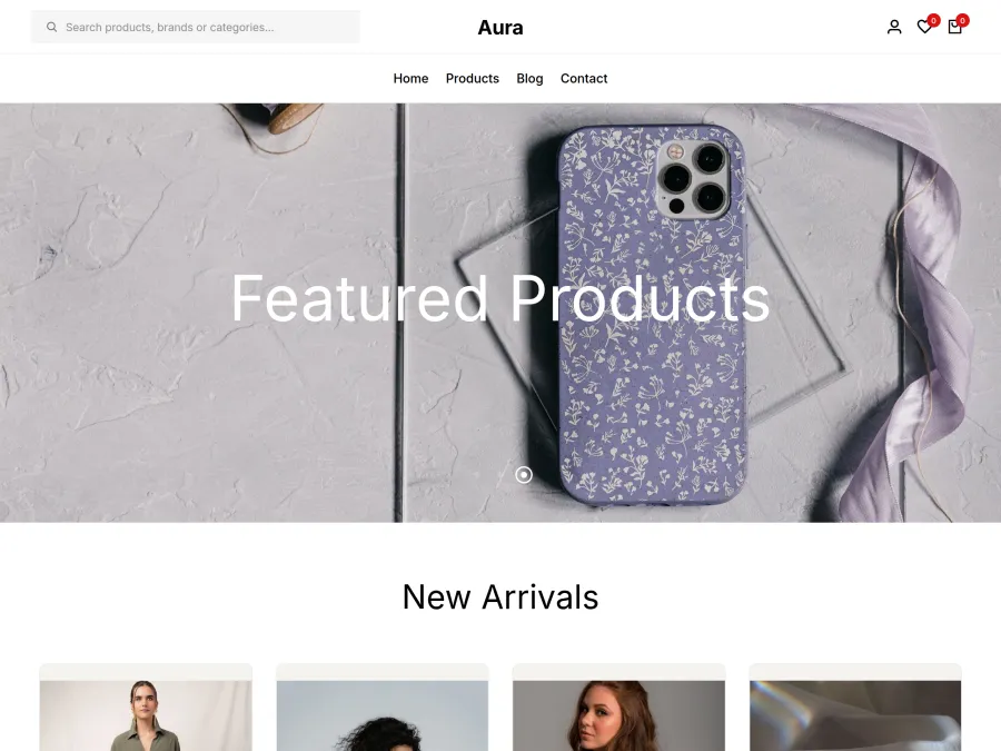
Same products, six different stores

A ready-made combination sets every part and the typeface in one click. All of the stores below are the same demo store; only the selected combination changes.

Store home page with the Theme default combination

Theme default

The Noir theme with no parts selected.

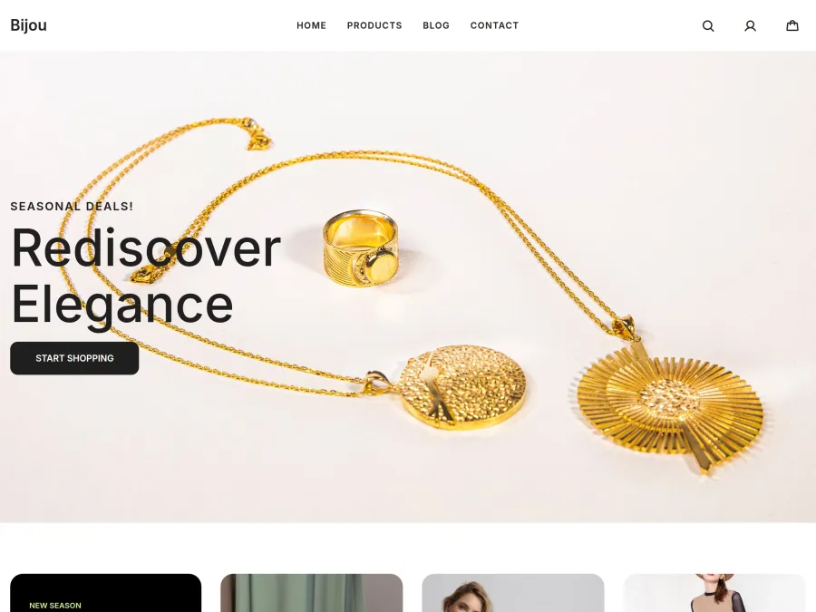
Store home page with the Boutique combination

Boutique

Large centred logo, split slider, round categories. Luxury style.

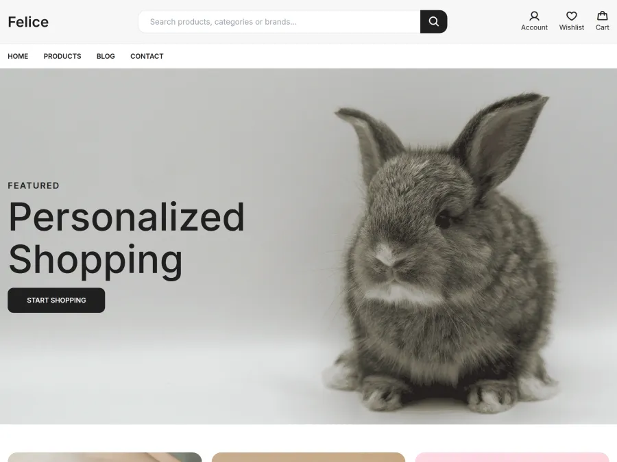
Store home page with the Megastore combination

Megastore

Search-first header, mosaic slider, tabbed product showcase. Simple style.

Store home page with the Minimal combination

Minimal

Minimal header, full-width slider, text category list. Sharp style.

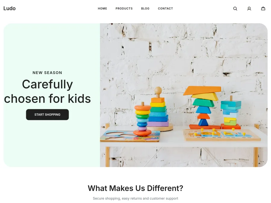
Store home page with the Cheerful combination

Cheerful

Sliding card slider, scrolling category strip, showcase with a promo card. Soft style.

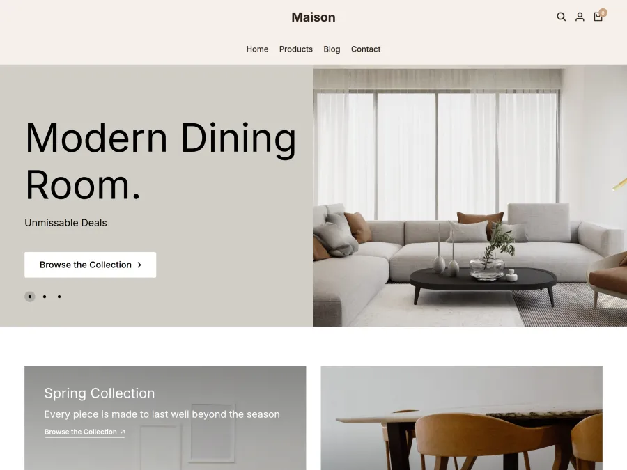
Store home page with the Home & Living combination

Home & Living

Floating header, framed slider, large category tiles. Classic style.

18 parts, over 160 layouts

You choose each part separately

Start from a combination and change any part, or choose every part yourself from scratch. “Theme default” is an option for every part as well.

Top

Announcement Bar Slim barWith arrowsScrolling textSplitHighlightedSide by sideWith countdownWith couponLight tintSplit
Header ClassicBoutiqueMegastoreMinimalFloatingLeft-alignedCentered logoMagazineSplitTransparent
Header icons Thin lineBold lineFilled
Mega menu ColumnsSplitAccordionDropdownImage cardsImage columnsShowcaseTabbed

Storefront

Slide Full widthSplitFramedMosaicSliding cardsCaptionedText boxTabbedPairFull screen
Category Showcase RoundedCard gridLarge tilesSliding stripText listPanelsCatalogFeaturedMagazineIndex with images
Product showcase GridScrolling stripTabbedWith promo cardFeatured ProductSide titleRankedRowsStaggeredLarge strip
Product Card ClassicMinimalFramedText on imageBoutiqueName and price side by sidePrice firstOn a backdropPrice tagFloating infoDark frame
Video Cinema bandSide by sideShort videosVideo + productVideo gridStory ringsPlaylistVideo and textShoppable videosMosaic

Trust

Campaign Banners Full widthSplitPairMosaicThree cardsSlim stripOverlapping cardWide + narrowFour-upSliding banners
Trust Bar Slim stripCentered boxesSide by sideCardsColored bandBig numbersBadgesWith headingText onlyRotating line
Customer Reviews Sliding cardsGridLarge quoteRating summarySliding stripReview wallCards with product photoQuotesFeaturedRating band

Bottom

Gallery GridMosaicScrollingSliding stripLookbookCollageTriptychMasonryExpanding panelsPolaroid
Brand Strip Sliding stripLogo gridSliding cardsTitle on the sideBrand index (A–Z)Typographic listBrand cards with productsMonogram badgesPopularity mosaicDouble scrolling rows
Newsletter SimpleColored bandSide imageImage backgroundcardUnderlinedSlim stripProduct collageFramedBig headline
Footer ColumnsCenteredNewsletter bandContact cardsSplitGiant brand nameRounded panelSingle lineLined gridCentered logo

Other pages

Product page ClassicSide stripGridWide imageCenteredCollageStreamInfo cardSplit screenWide details
Category page Left filtersTop filter barFilter drawerSubcategory showcaseList (catalog)Cover imageLarge cardsMosaicDense gridTabbed

Most parts also have an “I don't want it” option; the header and footer always stay.

Wizard

Step by step, top to bottom

The wizard first asks for a combination and a style, then goes through each part in order. The matching section is highlighted in the preview, and you can skip any step. At the end a summary shows which parts carry your own choice, and you publish with one button.

  • One step for each part
  • Jump back to any step from the summary
  • Opens right after setup if you choose “Build Your Theme” when signing up
The header step in the Build Your Theme wizard
Style packs

Typefaces and corners, matched across every part

Simple, Soft, Sharp, Luxury and Classic: each style pack sets the body and heading typefaces, corner rounding, button shape and use of capitals across every part at once.

  • After picking a pack, you can still change the colour and typeface
  • See each change in the preview as you make it
  • Switch between desktop, tablet and phone views
Choosing a style pack in the wizard
Design assistant

Describe the store you want

A sentence like “Women’s clothing boutique, elegant and simple” is enough. The assistant looks at your store’s products and categories and suggests a layout for each part and a style. You pick the ones you like and apply them; the result appears in the preview.

  • Opens from every wizard step and from the Theme tab
  • Lock the parts you like and try the rest again with “Shuffle”
  • On every plan, no extra cost
Build Your Theme design assistant: part suggestions based on a store description

Start with a ready-made theme

Each of the 10 themes can be used by any store. After choosing one, you change its colours, fonts and sections in the editor.

  • Switching themes does not touch your products or orders
  • Themes are designed for phone screens too
Theme editor

What's in the editor?

You choose parts in the Theme tab, edit sections in the Page tab, and set your logo, colours and typefaces in the Store appearance tab.

Appearance

Logo and faviconYou upload your store logo and the icon shown in the browser tab.
Brand colourButtons, add-to-cart and highlights take the colour you choose.
Fonts20 body and 41 heading fonts; all of them display Turkish characters and the ₺ sign correctly.
Header and footerBackground and text colours; a sticky header if you want one.

Page layout

Background colorSet the page background to white, off-white, light gray, cream or sand.
Width and spacingChoose the content width (narrow, standard, wide) and the spacing between sections (tight, standard, airy).
Section colorGive sections such as showcases, strips, gallery, reviews and newsletter a light, dark, brand-color or custom background.

Content

TextYou change headings, descriptions and button labels.
Slider and bannersUpload an image or a video and write the text on it; you also choose which part of the image shows on phones.
SectionsYou add sections, hide them and drag them into order.
MenuYou edit the links in the top menu.

Preview and publishing

Device viewYou switch between desktop, tablet and phone.
Select in the previewClick a section in the preview and its settings open on the left.
Draft and publishDesign changes wait in a draft; you publish them now or at a later date.
Step-by-step undoYou undo any step, and can roll back your last publish within 30 days.
Publish historySee recent publishes with their date and who made them, and return to the state before any of them in one click.
Frequently asked questions

About Build Your Theme

Do I need to know how to code to build my theme?
No. You see each part's layouts as cards; click one and the preview changes instantly. If you don't like it, pick another card.
Can I change just one part without breaking my current theme?
Yes. Every part has a “Theme default” option. You can change only the header or only the product card and leave the rest as the theme designed it.
What is a ready-made combination?
Five ready-made sets that configure every part and the style pack in one click: Boutique, Megastore, Minimal, Cheerful and Home & Living. After applying one, you can still change each part individually.
Do changes go live in my store immediately?
No. Design changes wait in a draft and only appear in the editor preview. They go live on your store when you press Publish or on a future date you choose. From the publish history you can return to the state before any publish from the last 30 days.
Is the design assistant paid?
No, it works on every plan at no extra cost. To prevent abuse there is a limit of 20 suggestions per store per day; once it is reached, the assistant keeps suggesting based on your store information.
How does it look on a phone?
Every layout is adjusted separately for phone screens. In the editor you can switch between desktop, tablet and phone views to check.
Are my products or orders affected?
No. Build Your Theme only changes how your store looks; your products, prices and orders stay exactly as they are.
What if I don't want a section at all?
Most parts have an “I don't want it” option, which hides that section from your store. The header and footer always stay, for navigation and legal links.
Which plans and themes include it?
It is available on every plan and works with all 10 themes in the theme gallery.
A secure, locally built e-commerce platform

Start today,
take your first order tomorrow.

Try it free for 14 days. No credit card, no commitment. If you don't like it, cancel and pay nothing.

14 days free
No credit card required
Cancel any time
Turkish & English support